It's been over a month since Windows 11 started generally rolling out, but since it is being made available in a staggered manner, not everyone has received it on their machine. Although there are ways to immediately trigger the update, it is perhaps advisable to know what's in store before you decide to do so. This is exactly what we've been exploring so far in our ongoing Closer Look series.
So far, we have taken a look at Search, Widgets, the Start menu, Snap Layouts and Snap Groups, the Taskbar, quick settings and notifications, Virtual Desktops, power and battery settings, default apps configurations, File Explorer, context menus, Teams integration, the updated Clock app in Windows 11, the Microsoft Store, the Snipping Tool, the Paint app refresh, the lock screen, the revamped Photos app, the voice typing experience, the storage settings, the touch keyboard, the Calendar app integration, and the Calculator app. Today, we'll be discussing a very specific feature, namely the Settings app's UI in Windows 11.
For the purpose of this hands-on, we'll be taking a look at the generally available Windows 11 build versus a publicly available and up-to-date Windows 10 (version 21H1 build 19043.1320). Right off the bat, I would like to emphasize that we are not looking at the entire Settings app (in fact, we have discussed many sections of it already in individual Closer Look articles), but will only be focusing on some specific UI updates.
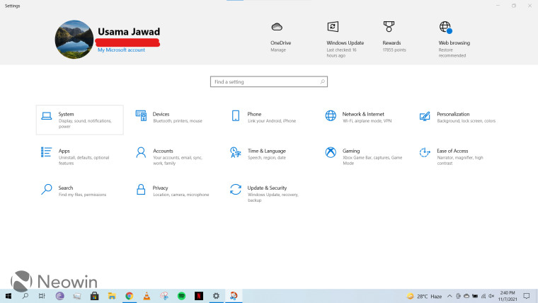
Starting off with the Settings app in Windows 10 first. On the landing page, you get some of your important information at the top, such as the account you're logged into, your OneDrive sync status, Windows Update, Microsoft Rewards points, and the option to use Microsoft-recommended browser settings. Then, there are also some more detailed configurations options below with their own sets of nested menus. There is also a handy search bar at the top of this section in case you don't exactly know where the setting you're looking for is situated. There are also subtle animations on hover and the item you currently have your cursor over is highlighted with a slight border as you can see on the "System" button in the screenshot above. I really like the simplicity of this UI.
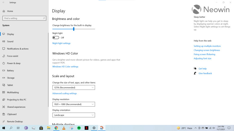
Like I said, we won't be discussing all the individual settings in detail. Instead, we'll be focusing on the general UI. As an example, I have attached a screenshot of the System > Display section above to demonstrate the UI pattern. When you click on a section on the landing page, you'll be directed to a dedicated page showing you subsections in the left pane, the associated configurations at the right of it, and then some helpful tips at the right. You can click on any of the options on the left to navigate to a setting and there's also a search bar if you don't exactly know where you want to navigate to. My main complaint with this is that Microsoft wastes a lot of space across all its interfaces. Scrolling in pages is a common but cumbersome activity and there is lots of whitespace, which I personally consider to be wasted potential to reduce scrolling.
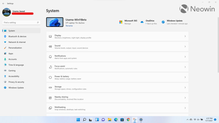
Coming over to Windows 11, it's really interesting to see that Microsoft has done away with the traditional landing page, kind of. What you see instead is the "System" page which launches by default with all the main settings shifted to the left pane. These sections also feature new colorful icons unlike the monochrome icons present in Windows 10. The System page launching as default also makes sense to me because it consists of what you would probably define as the "core" settings of an OS. There is still a separation at the top here which shows you your device's name, Windows Update, and OneDrive sync status. Microsoft Rewards have been removed from here and so has the ability to set Microsoft-recommended browser settings. This was a pleasant yet surprising change for me considering the anti-competitive practices Microsoft has been engaging in when it comes to default apps. Your profile information has been moved to the pane on the left.
I highly prefer this organization of the Settings app in Windows 11 due to how clean it looks as well as the consistency benefits that I'll talk about later.
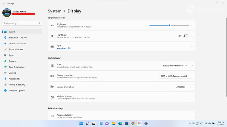
For the sake of comparison with the second screenshot from Windows 10, I have navigated to and attached a screenshot of System > Display in Windows 11. You'll immediately notice that the pane on the left is retained as-is, which I think is nice in terms of consistency as it translates across the entire app. Meanwhile, all the configurations themselves have been moved to the center of the screen, which means that you'll find an abundance of nested menus since this information was previously present on the left pane in Window 10. All the tips and feedback buttons have been moved to the bottom of the page. This makes sense to me as it seems more consistent to me and space is better utilized. Other minor changes to the UI also means that there is not a lot of whitespace and I have to scroll less. That said, I'm not sure if this is something that I just personally like or whether the feedback is universal across Windows 11 users.
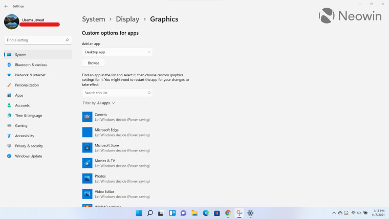
Another thing I would like to highlight is the presence of breadcrumbs at the top. An example can be seen above where I navigated to System > Display > Graphics. A really, really good move that Microsoft initiated in the Settings app for Windows 11 is to show this path at the top of the page. What this means is that I can easily jump between menus without having to press the "back" button, regardless of how deep I am in the configurations, in terms of nesting. This change has really improved my productivity and flow overall since I use the Settings app quite frequently for one reason or the other.
Overall, I think that Microsoft has done a really good job with the Settings app revamp in Windows 11. It's not perfect as you will come across some inconsistencies and wastage of space in specific sections, but I definitely think that the company is on the right track. I love the colorful icons and the presence of breadcrumbs as they have increased the speed at which I can quickly navigate through different menus. Moving all the settings and profile information to the left and keeping it consistent across all Settings pages regardless of what page you're on also ensures that you can quickly jump through all kinds of settings without having to navigate to the landing page (which is absent in Windows 11) every time. I'm eager to see how Microsoft further evolves this down the line via updates.
Take a look at the section here or select from the links below to continue exploring Windows 11 in our ongoing "Closer Look" series:
- Closer Look: Search in Windows 11
- Closer Look: Widgets in Windows 11
- Closer Look: Start menu in Windows 11
- Closer Look: Snap Layouts and Snap Groups in Windows 11
- Closer Look: Taskbar in Windows 11
- Closer Look: Quick settings and notifications in Windows 11
- Closer Look: Virtual Desktops in Windows 11
- Closer Look: Power and battery settings in Windows 11
- Closer Look: Default apps settings in Windows 11
- Closer Look: File Explorer in Windows 11
- Closer Look: Context menus in Windows 11
- Closer Look: Microsoft Teams integration in Windows 11
- Closer Look: Clock app in Windows 11
- Closer Look: Microsoft Store in Windows 11
- Closer Look: Snipping Tool in Windows 11
- Closer Look: Paint in Windows 11
- Closer Look: Lock screen in Windows 11
- Closer Look: Photos app in Windows 11
- Closer Look: Voice typing in Windows 11
- Closer Look: Storage settings in Windows 11
- Closer Look: Touch keyboard in Windows 11
- Closer Look: Calendar app integration in Windows 11
- Closer Look: Calculator app in Windows 11


_small.jpg)


11 Comments - Add comment
Advertisement