Following its release in the Windows Insider Program a couple of months ago, Windows 11 finally has a general availability date of October 5, roughly a month from now. While the OS is still under active development, we feel that it is worth looking into some of its features in more detail and give our readers an idea about what to expect come October 5, or whenever they decide to upgrade.
So far, we have explored and discussed Search, Widgets, the Start menu, and Snap Layouts and Snap Groups in considerable detail. Today, we'll be taking a look at the taskbar, which has gone through a major revamp in Windows 11 and is usually the first thing that people notice in Microsoft's marketing material and promotion.
Before we dive into the taskbar, it is important to remember that given Windows 11's active development status, it's possible that some of the things we talk about may change by the time of general availability. For the purpose of this hands-on, we'll be taking a look at Windows 11 build 22000.168 that was released last week versus a publicly available and up-to-date Windows 10 (version 21H1 build 19043.1165).

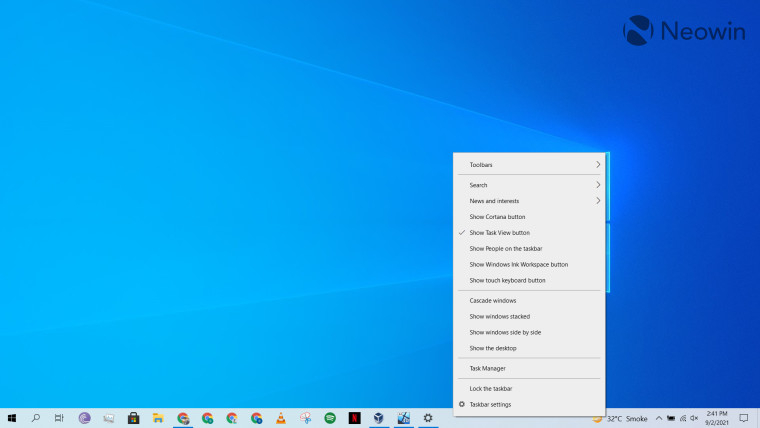
As usual, we start with the Windows 10 taskbar to freshen up our memories a bit. By default, the taskbar is justified to the left with the Windows button for the Start menu and some other controls like Search and Task View next to it. You can right-click on the taskbar and then choose to hide or show certain controls using the context menu. You can pin items like apps and shortcuts to the taskbar depending upon your use-case. Personally, I pin my most-used apps to the taskbar with the least-used apps pinned closer to the left corner. On the right side of the taskbar, we have a space for the recent "News and Interests" widget (that can be disabled), following by some other system icons such as battery, internet connectivity, device volume, time and date, and the notification tray.

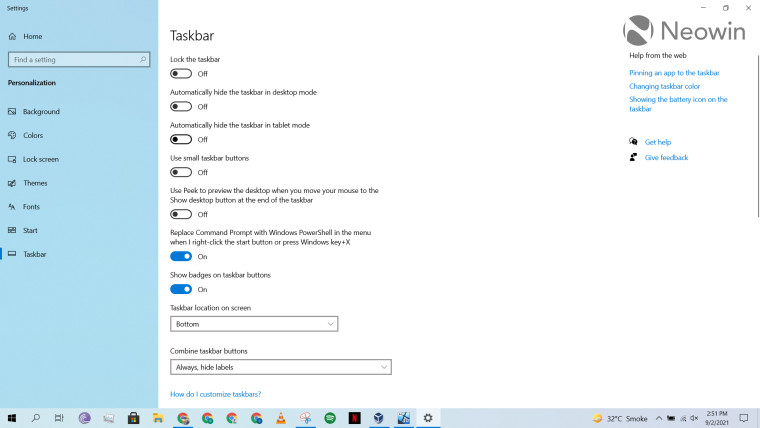
Microsoft offers a ton of customization options for the taskbar in Windows 10, and some of them can be seen above. These include locking the taskbar, hiding it in tablet mode, changing its location, disabling badges, combining taskbar buttons, and a separate batch of settings for multiple displays and contacts. You can configure a lot of settings here to customize the taskbar to your liking and use-case and it's fairly flexible.
_story.jpg)
When we move over to Windows 11, the situation is completely different and in stark contrast to Windows 10. For one, the taskbar is centered by default, which isn't a major concern for me. This is because I usually left-justify it anyway, which is still possible in Windows 11. The problem is that these are the only two alignment options Windows 11 offers. If you want to have the taskbar at the side of the display or at the top, you're out of luck. This is likely done keeping in view the new Start menu, but it will bother a lot of people who don't like either of the two available alignment options.
The layout is similar to Windows 10 otherwise in the sense that the Start menu is to the left with some controls like Search, virtual desktop, widgets, and Teams pinned next to it, followed by pinned items of your own choosing. Again, the predefined apps can be hidden if you right-click on them. For people such as myself who like their own frequently-used apps closer to the middle of the display horizontally will either have to hide all the default icons or left-justify the taskbar in order to achieve the same affect as Windows 10.
Coming over to more missing features, perhaps the biggest is the absence of the right-click context menu for the taskbar. On Windows 10 (scroll to the first screenshot), this menu offered a bunch of useful capabilities like cascading windows, stacking them, centrally controlling what system icons you want to enable or disable, and more. The menu is completely missing in Windows 11 and if you right-click on the taskbar, you get a measly "Taskbar settings" prompt.
Another change likely to annoy people is the fact that you cannot drag-and-drop apps or shortcuts to pin them to the taskbar. Windows 11 simply does not allow this behavior. While I don't use this capability much - I go the old-fashioned way of right-clicking and then clicking on "pin to taskbar" -, the lack of it will certainly bother people who do utilize it.
_story.jpg)
Moving over to the right side of the taskbar, we have some other major changes. The notification area has been done away with and only shows when you do have a notification to click on. In the same vein, the notification and settings trays have been split up. Notifications now show up in a separate window, while quick settings can be accessed when you click on any of the icons in the right corner. Perhaps we'll discuss this in more detail in another Closer Look article.
_story.jpg)
The new quick settings UI discussed in the previous paragraph can be triggered if you click on any of the icons on the right side of the taskbar. The thing I do not like about this at all is that instead of only showing the relevant quick settings - for example, clicking on the volume icon should only show the volume controls -, it shows you all the quick settings collectively. Overall, this means that the quick settings tray now takes up less screen estate compared to Windows 10 if you want to view all settings collectively - which I appreciate - it also means that they actually take up more space compared to their predecessor if you just want to view dedicated settings.
I think both the notifications and quick settings areas deserve their own Closer Look article, but I've briefly discussed them here because they are closely related to the taskbar behavior.

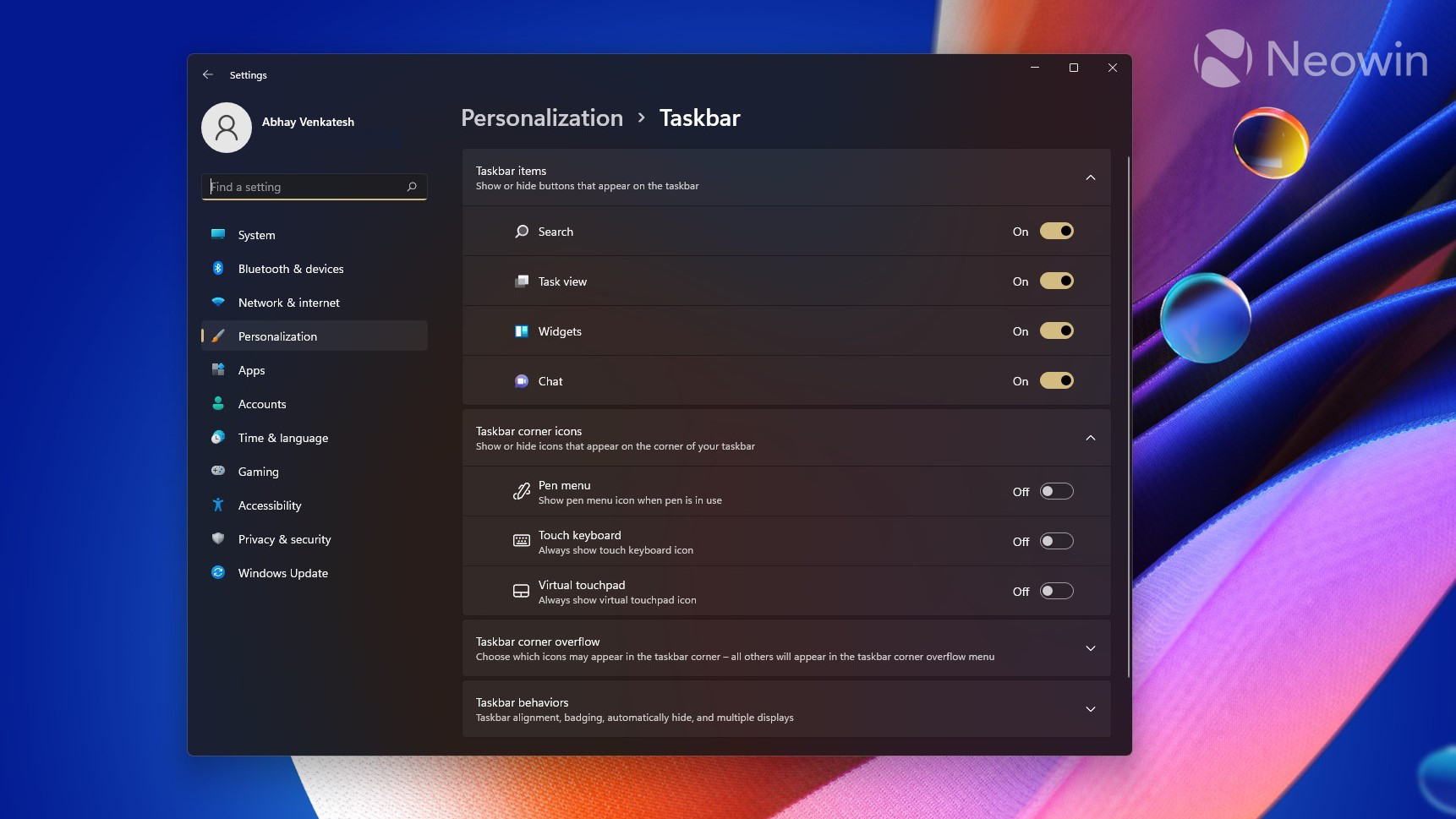
Moving on to the final piece of the taskbar puzzle, we have its personalization and customization settings. Similar to the taskbar itself, these configurations have been stripped back as well. As can be seen from the screenshot above, you can't lock the taskbar, use smaller icons, combine them, or move the taskbar to the top or side of the screen.
Although settings for contacts are gone, those for multiple displays are still there but grouped under "Taskbar behaviors". You can also utilize these configurations to enable and disable certain taskbar items, corner items, and corner overflow items. Almost all of these settings could be found in Windows 10 as well but are grouped slightly better in Windows 11.
Overall, my outlook on Windows 11 taskbar's is quite negative. Microsoft seems to have cut back on a lot of features and while I understand that some it has been done for simplicity and consistency, I don't understand why the ability to open the taskbar's context menu on right-click is not available and why items cannot be dragged and dropped to the taskbar, among many other things.
My hope is that the reason for this is that Microsoft is revamping the behavior and/or UI of these components and that we may see them in upcoming builds. However, with Windows 11's general availability just around the corner, this seems like a far cry at this point - at least in terms of getting the missing capabilities by October 5. Then again, it's also possible that Microsoft wants to do away with the features completely and wants user to adjust to the current Windows 11 taskbar as the new normal.
We'll likely find out more closer to October 5, but for now, I feel like too much has been taken away from the taskbar's capabilities to justify the increased simplicity.
In the meantime, what are your thoughts on the current state of the Windows 11 taskbar? Do you like the changes? How would you like to see Microsoft enhance it further? Let us know in the comments section below and inform Microsoft via the Feedback Hub too.
Take a look at the section here or select from the links below to continue exploring Windows 11 in our ongoing "Closer Look" series:


_small.jpg)


20 Comments - Add comment
Advertisement